
The catwalks and the world environment are dressed in the color set by certain organizations with the power to decide the fashion shades. Around this chromatic profile, designers develop their garments and accessories and adjust all their creations to the shades defined for the time.
Each season is loaded with clothing and accessories with different dyes. They are seen in online stores like na-kd, adapted to the new trends and their new nuances.
But do you have any idea what the choice of these colors is based on? In the following lines we tell you who decides which shades to use in the different seasons of the year.
Who makes the decision?
The tone that will adopt the fashion of the season is designated through a previous analysis and consensus among knowledgeable organizations in the field. They are International Colour Authority (ICA), Intercolor and Pantone.
For the annual selection of the leading color of the season, several aspects are taken into account: the political and economic context of the countries, lifestyles and social and protest movements, the opinions of the population, important events, favorite cities or destinations. Finally, the colors that were previously in fashion, the sectors in general and everything that is part of international events.
Pantone has established itself as the most prestigious institution when it comes to choosing the most popular shades for each season.
The authorities issue the final verdict on color two years in advance. Thus, the industry and its designers have the time to tailor their garments or accessories to the new fashion guidelines. In addition, they prepare their collections in a synchronized manner.
The disclosure of the color of the year has become a pressing moment for everyone involved in the world of fashion, art and artistic or creative design. As we mentioned before, this decision is not taken unexpectedly. Experts with vast knowledge in visual and chromatic trends invest time in researching everything about color in the real environment from a variety of sectors and areas of global culture.
Colors and shades that rule the season
After completing an arduous research, all the data collected by the expert committee is processed. From a single chromatic line, a precise shade is selected that summarizes a whole arsenal of world events during a calendar year. Such a shade drawn from an extensive color palette represents a set of values during that period that, in one way or another, marked a crucial stage of life today.
Pantone, the world’s color leader
Pantone has positioned itself among fashion scholars, and art in general, as a major player due to its high level of popularity. Every season it launches its fashionista prophecy according to the dominant criteria and factors on the world stage.
For example, Pantone named the ‘true red’ color of the year in 2002 in remembrance of the tragedy that shocked the world on September 11. Then, in 2018 the color ‘ultra violet’ sealed a new vision of the world toward progress and equality. .
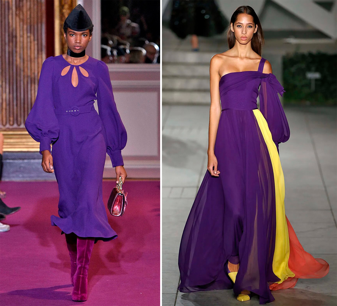
The ultra violet shade at Andrew Gn’s fall-winter 2018 runway show (left) and at Carolina Herrera’s spring-summer 2018 runway show (right).
With more than two decades of predictions about aesthetics and fashion in each season, Pantone has established itself as a global arbiter of color. It warns about the direction that color shades will take in outfits, accessories, textiles, make-up, canvases, and decoration in general.
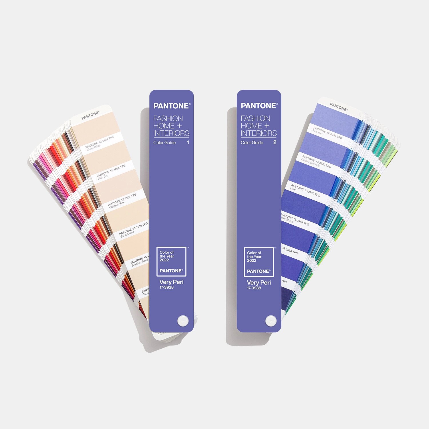
Pantone and the color of the year 2022
Pantone opted for this 2022 for the tone ‘very peri’, which mixes periwinkle blue with violet red. It symbolizes the transformations of society, its violent changes, forced isolations and the evolution of life between the physical and the digital that has changed our consumption habits and the way we interact.
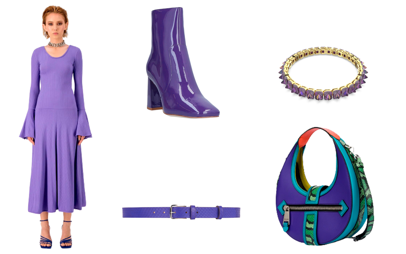
Bogdar spring-summer collection 2022 – From left to right and from top to bottom: Jeffrey Campbell boots – Swarowski choker – Barbara Bui belt – Moschino Hobo handbag
The ‘very peri’transports us to a virtual reality where new doors are opened to color. Also to the conception of new digital designs that are manifested within a physical framework of modernity.
Shades of purple, violet and lilac embrace each other to emanate mixed, varied and disparate feelings between those who love the balance of violet and its detractors.
Colors of 2023
Pantone previewed ten colors and five new classics at London Fashion Week that will be trending in 2023: ‘Cherry Tomato’ (Pantone 17-1563), ‘Persimmon’ (Pantone 16-1544), ‘Iced Mango’ (Pantone 14-1140), ‘Blazing Yellow’ (Pantone 12-0643), ‘Titanite’ (Pantone 16-0229). Also ‘Andean Toucan’ (Pantone 16-6230), ‘Airy Blue’ (Pantone 14-4122), ‘Electric Blue Lemonade’ (Pantone 18-4245), ‘Spring Crocus’ (Pantone 17-3020), and ‘Pink Cosmos’ (Pantone 6-2122).
Cherry Tomato shade at Victoria Beckham’s spring-summer 2023 fashion show – Titanite shade at Act Nº1’s spring-summer 2023 fashion show – Electric Blue Lemonade shade at Alberta Ferretti’s spring summer fashion show – Pink Cosmos shade at Bmuet(te)’s spring-summer 2023 fashion show
Y los clásicos: ‘Oyster Mushroom’ (Pantone 13-4201), ‘Grey Jade’ (Pantone 14-6011), ‘Tender Peach’ (Pantone 12-0912), ‘Mocha Mousse’ (Pantone 17-1230), ‘Bluing’ (Pantone 19-3954).
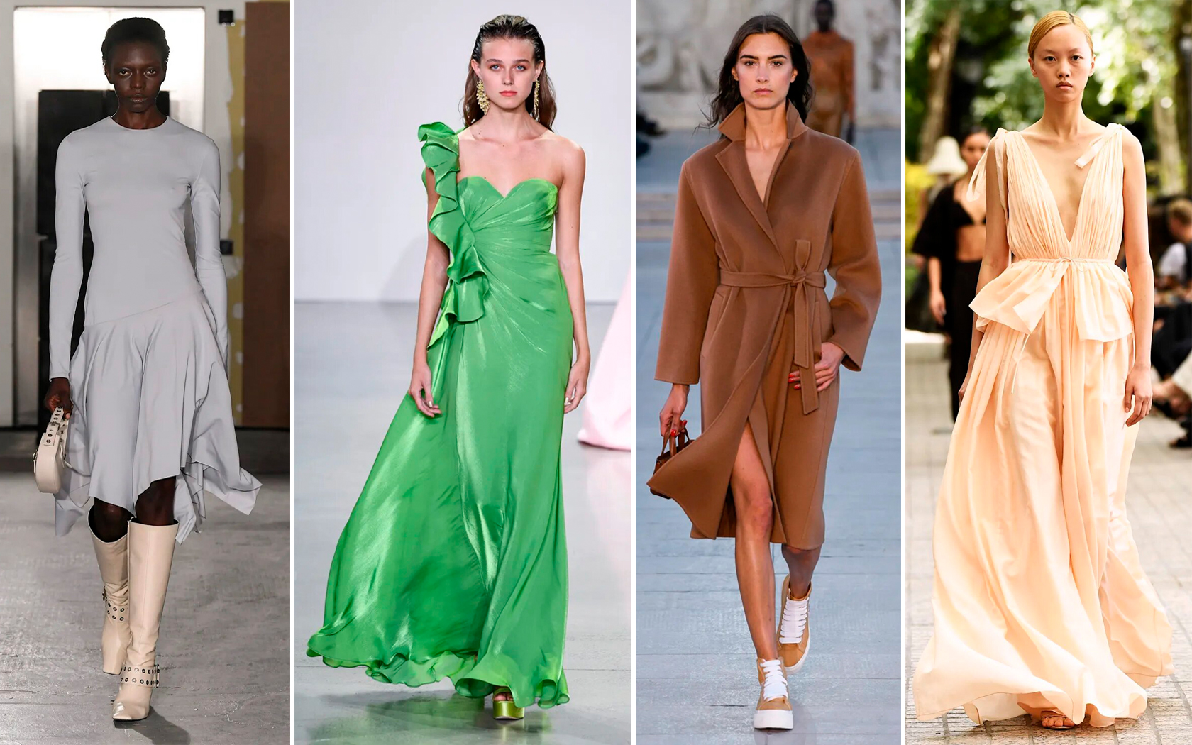
- Oyster Mushroom shade in the spring-summer 2023 runway show by Abra – Grayded Jade shade in the spring-summer 2023 runway show by Badgley Mischka – Mocha Mousse shade in the spring-summer 2023 runway show by Akris – Tender Peach shade in the spring-summer 2023 runway show by Adam Lippes
Credits to the brands mentioned.


