
In its latest program ‘Made of Makers’, the Swiss house brings together designers, artists and craftsmen from different sectors. Broadening the artistic gaze. Connecting watchmaking and art through creativity, mastery and precision. Echoing in this new collaboration, the Barcelona-born typographer Alex Trochut based in New York, creates the typeface 1931 Alphabet for Jaeger-LeCoultre.
Through the 1931 Alphabet, the contemporary alphabet rooted in art deco, Alex Trochut has been able to represent the soul of the brand.
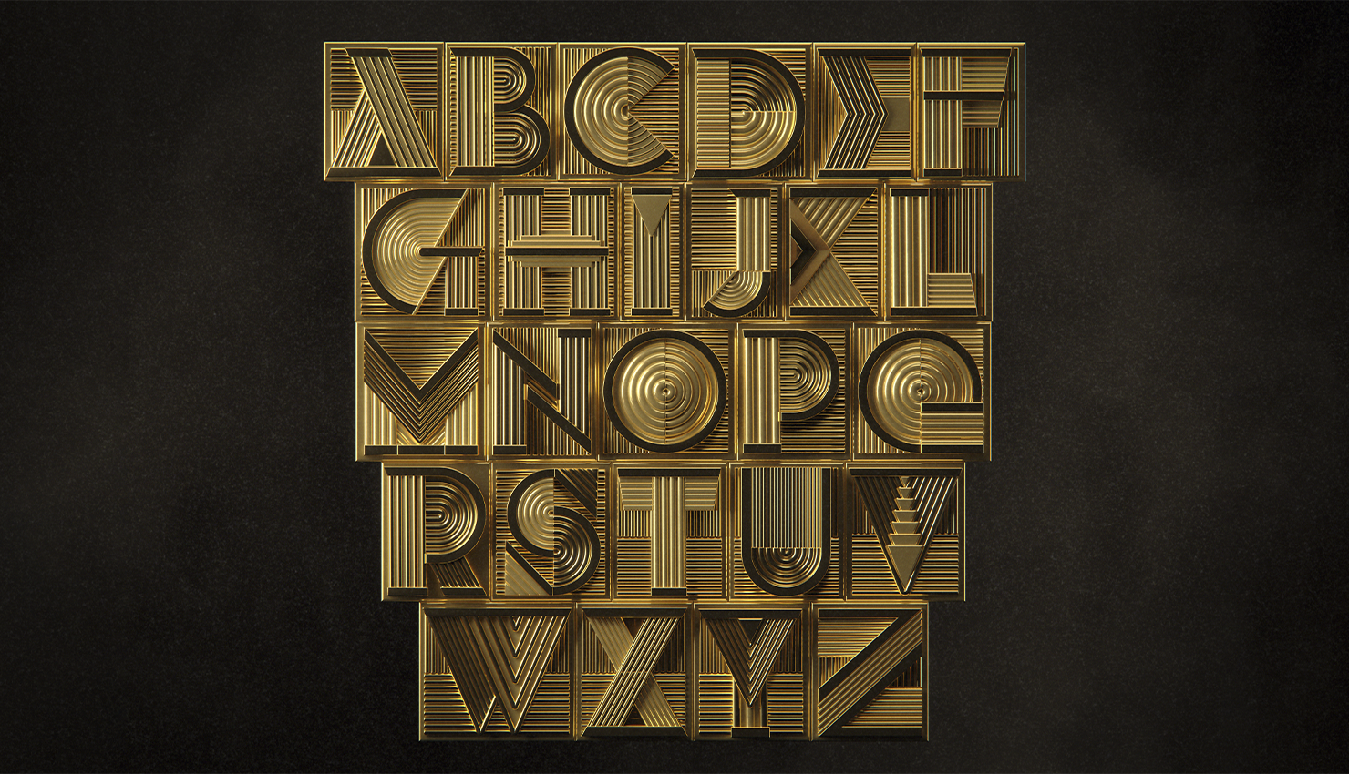
Alex Trochut creates for Jaeger-LeCoultre ‘1931 Alphabet’. A contemporary alphabet in art deco style.
During the 1920s and 1930s art deco was an expression of the modernist, innovative and optimistic spirit where an interest in creativity, technology and progressive thinking spread. Values that are always present in the Grande Maison.
Composed by its three-dimensionality and visual depth. At the same time, the optical sensation recreates motion. Creator of complex works, which apparently may seem simple, but which take letters and words to the limit. Being able to compose a very particular aesthetic vision. For the text and its image represent a unique form.
When I started creating the designs, a concept emerged that fused art deco and watchmaking craftsmanship. I wanted the letters to have a three-dimensional look and show off their intricate parts. As functional as they were ornamental. As if it were a machine in motion. – says Trochut.
For Alex, the first thing that is presented is the image of the word, to later read it. Empowering the language as a visual medium. Redefining the traditional ideas of what typography can be today. Considering that the design of the letters itself “is the non-verbal communication of the written medium“. In addition to being inspired by art deco, over the years he has connected with pop culture, fashion and music. As well as referential characters such as Picasso, Dalí or Miró. Creating works for renowned brands such as The Rolling Stones, The New York Times or Nike. Adapting their designs to each brand, because what they represent is unique and personal. Fusing aesthetics with the culture that unites them.

The alphabet created by Alex, through the lines, is engraved in a special way on the watches. Combining calligraphy with more classical and innovative techniques
From the artist’s own perception, the nature of his work and that of the watchmakers of Jaeger-LeCoultre, are profoundly united. The craftsmanship and technique, essential elements for watchmaking and typography. Connecting and fitting every detail as if it were a puzzle. Small details that work harmoniously within the created system. Over the years, the artist has developed techniques and finishes with very expressive results. Linking the visual, emotional and traditional sense, highlighting the great legacy left by his grandfather, Joan Trochut..
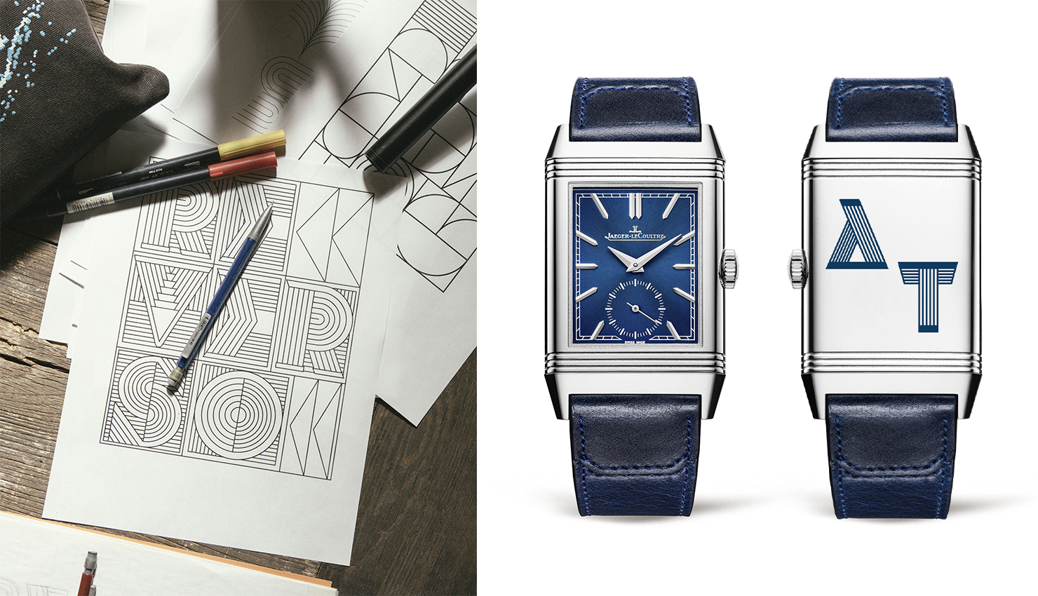
The 1931 Alphabet engraved on the back of the watch. Being a personal and unique element for each person.
The latter, created in the 40s a typographic system referential in history. And that heritage that carries with it, is recognized by Jaeger-LeCoultre. Catherine Rénier, executive director of the Swiss house, considers that this heritage as a basis expresses perfectly the present and the future of the new creations. Thus, the 1931 Alphabet is presented as the new style of the Reverso caseback. Appearing engraved on current and future creations. Transmitting personality traits very characteristic of the brand. Carrying with it luxury, class and poise. .
Images courtesy of Jaeger-LeCoultre


