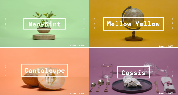
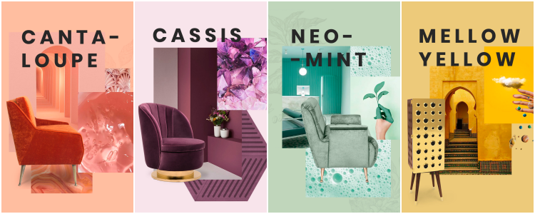
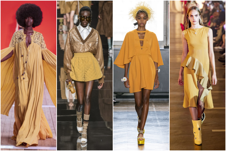
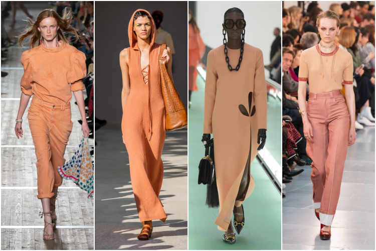
The colors mark an era and reflect the style, the moment and the feelings of society. That is why, every year end, the world of fashion, design and interior design wait anxiously to discover what will be the colors that will set the trends for next year. For the web WGSN, a global trend leader,the colors of 2020 will be the Neo-mint, the Cantaloupe, the Mellow Yellowand Cassis. .
These four soft shades reflect a society that is becoming more aware of the planet and its emotions. They bring peace, freshness and youth to a world in which we are turning more and more to feelings. They are also gender-neutral colors, avoiding sexist categorizations.
Neo-mint: the color of spring 2020
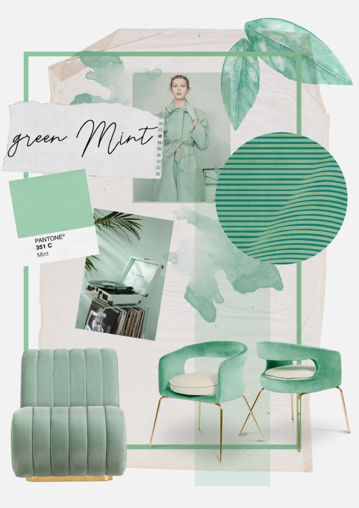
This soft shade of green is, without a doubt, the star of the coming year. Its freshness makes it bring a futuristic and current feeling although, if that is possible, providing a certain vintage look. All this without leaving aside the natural look with which green tones are always associated. .
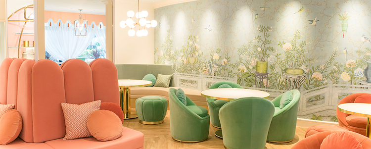
In interior design, its “clean” character makes it the perfect color for any room. Including bathrooms and kitchens. It can be used in large surfaces, since its soft tone does not overload the spaces. However, it will be much easier to introduce it in our decoration as a touch of color. In essential Home we find from a piece of furniture, a sofa, an armchair, some cushions to a wallpaper, etc. .
It combines perfectly with a multitude of shades. From brownish gray, for a more neutral environment, to blues, greens, pinks, lilacs… for more colorful homes. In fact, if there is a color with which it combines perfectly is Cantaloupe, the coral of the season. .
In fashion, Neo-mint will be a clear protagonist of spring 2020. We will see it in a multitude of garments and accessories, mixed with other colors or in total look. It gives outfits a youthful and casual look. .
Mellow Yellow: Back to the 60s
This shade of soft yellow is very similar to the popular 60s mustard tone that we have seen gaining strength in recent seasons in both fashion and design. Extremely versatile, it can be used perfectly in both winter and summer with the same ease. It combines very well with greens and golds. .
Cantaloupe: the transition from 2019 to 2020 .
If the Pantone Institute chose Coral as the color of the year 2019, Cantaloupe is the version for 2020. Amuch more muted tone, in the pastel range, but just as cheerful and flattering. Its warmth makes it blend perfectly like wood, which is a great advantage in design. .
Cassis: elegance and sophistication
Of all the colors of 2020, it is the most out of the norm. It is still subtle, although it moves away from the joviality of the other shades. Cassis is an elegant and sophisticated color. Its richness makes it become the protagonist of any look or room in which it is found. .
The colors of 2020 are soft, youthful and neutral. Very soon brands will start launching new products following these color ranges – will we let them fill our homes and closets? .
Images courtesy of Essential Home (furniture) and Livingly(fashion).
