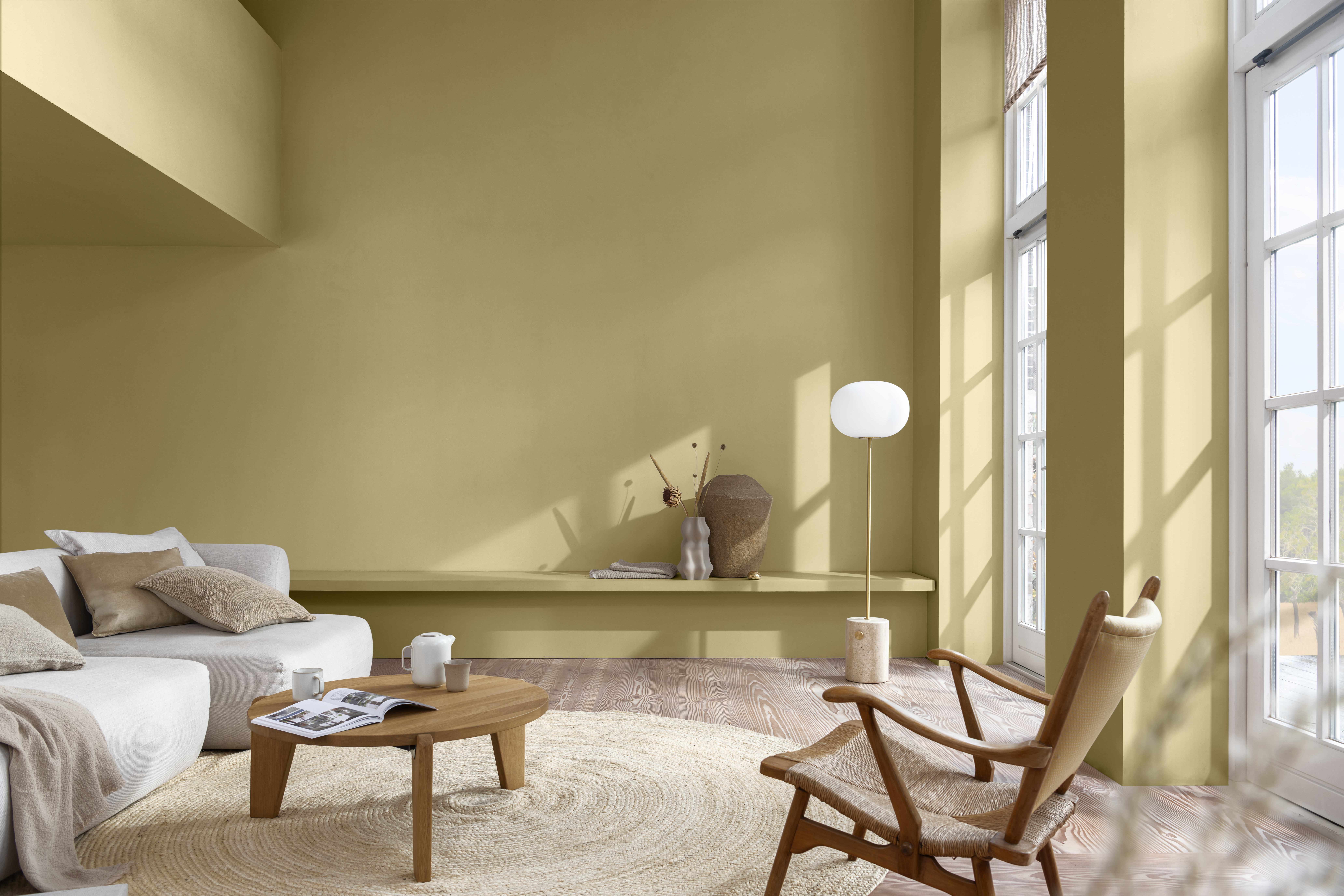
On 25 October, Bruguer presented Trigo Silvestre, its colour of the year for 2023.
Every year, many companies opt to choose the colours of the season. To get here, there is an extensive research on global trends, which studies the connection of the current world that fits the mood of the moment. The leading company in decorative paint, Bruguer, has already presented what is going to be its colour of the year 2023: Wild Wheat.
This shade, inspired by the warm tones of the harvest fields, is intended to set the decorative tone for the coming season and bring nature into every corner and every home.
The choice of the colour of the year
Bruguer, the AzkoNobel brand, leader in decorative paints and colour trends, has carried out extensive research into global trends. It has done so together with colour and decoration experts from the AzkoNobel Global Aesthetics Centre.
Nature is what inspires us and makes us feel better in our lives and in our homes. In this way, Wild Wheat speaks to us in a language we instinctively understand. According to Heleen van Gent, Creative Director of the AkzoNovel Global Aesthetic Centre.
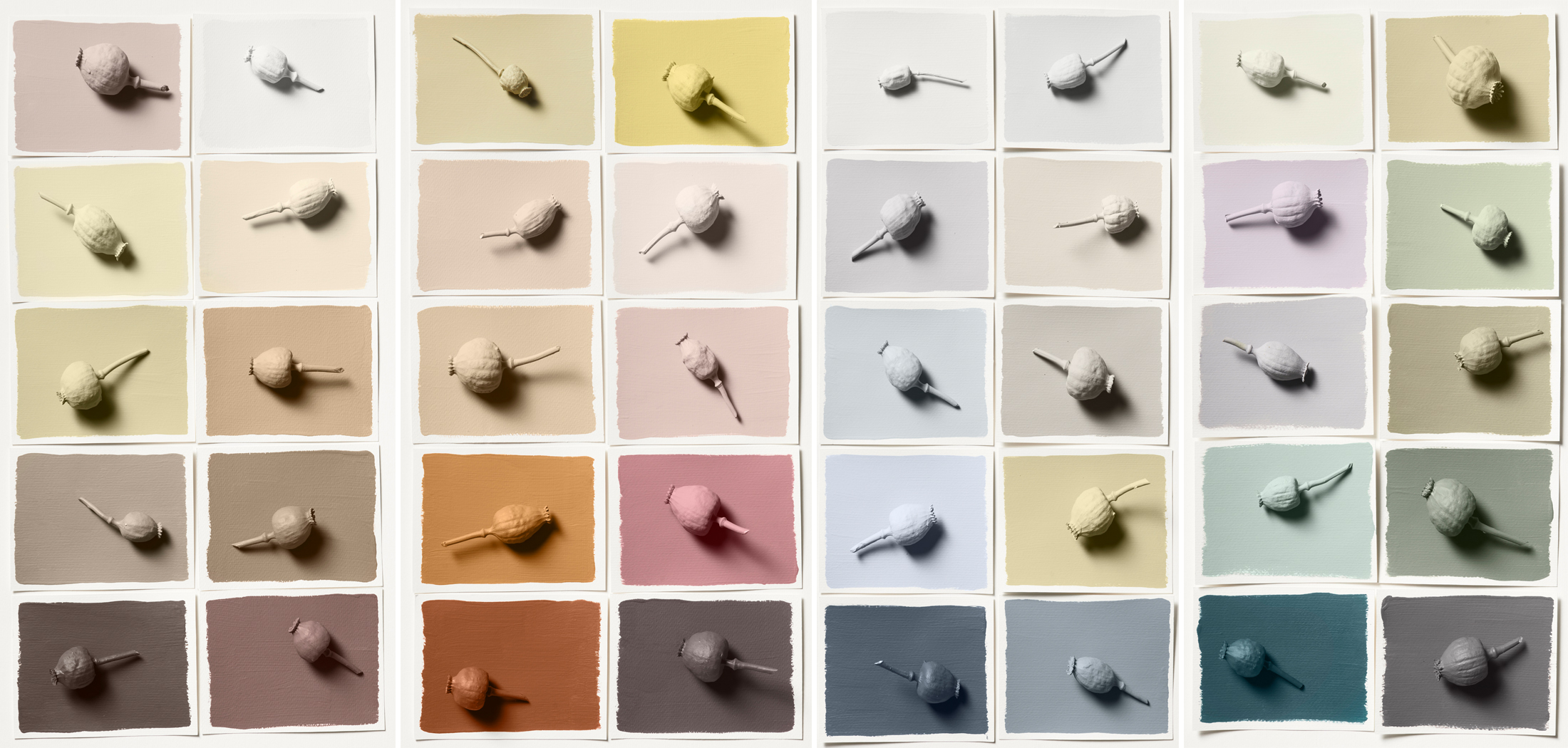
Based on the Wild Wheat shade, Bruguer has created four new palettes that tell their own story and provide a different look and feel. Firstly, Harvest Colours, which – through delicate shades – aims to reflect the raw material of nature. The second, Prairie Colours, lively shades that celebrate the biodiversity of a field of wild flowers and bring energy and harmony. Thirdly, Colours of Water, inspired by the rhythms and tides of the natural world with soft, flowing colours typical of the coast. Finally, Forest Colours, a palette of brown and green pigments, warm and inspiring.

Bruguer presents the four colour palettes for this year, from left to right: Harvest Colours, Meadow Colours, Water Colours and Forest Colours.
The importance of nature
Bruguer and Azkonobel have found evidence that for the search for support, connection and balance in today’s world, we tend to immerse ourselves in nature. That is why Bruguer has opted for this colour that reminds us so much of the natural world:
For the first time in 20 years, our entire colour palette is inspired by the rhythms of nature. says Heleen van Gent.

Wild Wheat is a shade inspired by nature and the emotions it transmits to us.
Moreover, the environment is one of the main concerns of the population and world leaders. Therefore, a colour that reminds us of nature and all that it gives us. Having the colours of the landscapes around us at home gives us security, a sense of refuge and positivity.
Decorating the home well to improve quality of life
It is important to bear in mind that colours can positively or negatively affect our mood. For this reason, it is vital to choose well the colours that are going to form part of the different rooms in our home, ensuring that they are pleasing to the eye and transmit firm and positive sensations.

Using pleasant colours that remind us of nature in our home can have benefits for our mood.
Bruguer has once again opted this year for a shade that is found in nature. For the colour of the year 2022, the chosen one was Fresh Air. In 2023, the line is the same, with the main objective being the revitalisation of our homes. Thus, they aim to highlight the transforming power of paint, constantly making spaces more flexible according to the current needs of the consumer and providing people’s lives with colour.
This coming year 2023, AzkoNobel celebrates the 20th anniversary of its ColourFuture trend forecaster – the initiative that determines the colour of the year – as well as the commemoration of the team’s three decades at the forefront of trend analysis, research and colour design and art direction at AzkoNobel.


